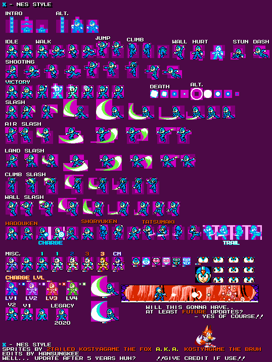
X (NES-Style)
(Current scale is below 100% - zoom in to view full detail)


| Asset Info favorite | |
|---|---|
| Name | X (NES-Style) |
| Category | Custom / Edited |
| Game | Mega Man X Customs |
| Section | X |
| Submitted | July 30, 2020 |
| Uploaded By | KostyaGame the bruh |
| Additional Credits | hansungkee |
| Size | 32.51 KB (538x717) |
| Format | PNG (image/png) |
| Hits | 12,315 |
| Tags (1): | |
Animated GIFs (24)
Climb

E-Tank pick-up

Hadouken

Hadouken (with charge)

Health-up pick-up

Hurt

Idle

Jump

Jump (shooting)

Life pick-up

Shoryuken

Spawn

Spawn (Alt)

Tatsumaki

Tatsumaki (trail)

Victory pose

Walk

Walk (shooting)

Walk (start)

Z-Saber Air Slash

Z-Saber Climb Slash

Z-Saber Land Slash

Z-Saber Slash

Z-Saber Wall Slash

Comments (22)
You must be logged in to post comments.
#XForMegaManArena
drop update on X yet again!
- Now X can swing with Z-Saber!
- Added palette limit for Z-Saber swing's
Prepare to see Armors i guess
- Now X can swing with Z-Saber!
- Added palette limit for Z-Saber swing's
Prepare to see Armors i guess
@SolarReaper thank u!!
Wow. What a difference 5 years can make!
You've truly improved your craft, Kostya!
You've truly improved your craft, Kostya!
@UlticraftMTT Thanks!
By the way, this was a first wave! Prepare to the next second wave!!
By the way, this was a first wave! Prepare to the next second wave!!
Really good update! I like that he's based on the SNES sprites, it's a nice change of pace from all of the other 8-bit X sprites that were based on the PSX sprites.
What an update! Good job!
So.. update after 5 years huh?
i cant wait for the max armor
perfect sprite sheet
Jesus Lord this looks bad and cheesy
Mind if I do an extension with the rest of the possible armors that X could obtain in the games? I will send it your way when finished.
Checker Zero?
@TwoTailedHedgehog2004 (above your last comment) ok, in the next update I will change the name, and Hyper Max Armor is just a change in the palette dude, and by the way I will add not only for Max Armor Checker Zero, but also for X himself
BTW The first armor is the Light Armor and the second armor is called the Giga Armor. Max Armor is the third Armor. the Golden Armor is the Hyper Max Armor.
Are there going to be double charge shot sprites for the Giga Armor and the eventual Max Armor?
Next update: Third Armor / Golden Armor (palette), more palettes for armor and MegaMan X
@hangsukee what
It's Looks so Near Bad... Sorry.
But Years Later Looks Better now.
But Years Later Looks Better now.
I'd love to see all the armors in this style, but I know that would take a lot of work.
| keyboard_double_arrow_left keyboard_arrow_left | Page 1 of 2 | keyboard_arrow_right keyboard_double_arrow_right |