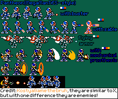
Pantheon (Mega Man NES-Style)
(Current scale is below 100% - zoom in to view full detail)


| Asset Info favorite | |
|---|---|
| Name | Pantheon (Mega Man NES-Style) |
| Category | Custom / Edited |
| Game | Mega Man Zero / ZX Customs |
| Section | Enemies |
| Submitted | September 25, 2020 |
| Uploaded By | KostyaGame the bruh |
| Size | 14.15 KB (241x202) |
| Format | PNG (image/png) |
| Hits | 4,612 |
Animated GIFs (0)
Comments (6)
You must be logged in to post comments.
Cheesy
At least u tried
U did ur best
U did ur best
BBLIR said some things for me already that I see that could be improved. Another thing I'd like to point out is that the sprites should be a little bit more spaced out. Don't be afraid of making the credits tag a little big, it's better to have a readable tag, than it is to have one that's squished and hard to read
He's completely right actually.
These sprites are super unreadable, as I see on all his sheets. Too many details, not enough surfaces.
The animations show no real effort, I don't think he puts much thought into them
I'd analise the shaping consistency, as I see it as a problem on hans' sheets, but I can't see anything at 1x scale so I'm not gonna bother.
I've also talked to a friend about this and apparently this dude doesn't listen, like, at all.
In general I think his sheets are way below standard and should be more strictly analysed. Personally, I'd stop accepting them for at least 4 months.
That's quite the cocky and rude thing to say. How about telling Kostya how the sprites can be improved instead?
Sorry, My Sprites was Better Than Yours.